
Stock market barometer

The structure of the stock market barometer
To calculate the stock market barometer, criteria such as interest rates, inflation, currency ratios, cash flows, industries, and intermarket analyzes (gold, bonds, stocks) are taken into account.
Breadth indicators, sentiments and volumes are used for shorter-term timing. The way it works is similar to the well-known Fear and Greed Index published by CNNBusiness.
1.
Macroeconomics
2.
Volume flows
3.
Industrial groups
4.
Sentiment indicators
5.
Breadth indicators
Why does the stock market barometer have to work?
It is actually known to every experienced investor that the stock market is somehow related to interest rate developments or inflation. Most technical analysts are also familiar with, for example, the Advanced Declines line or the sentiment indicators.
Many try, like we did at the beginning, to predict or assess the stock market assessment with a single indicator. That would be pleasantly easy, but unfortunately it doesn't work that way. Sometimes the sentiments react too quickly or the interest rates too late, as well as a pure moving average over 200 days will always react too late.
But in all cases the indicators react!
Consequently , the model presented here must work. Indicators always react! There will be no major crash if the sub-indicators do not sound the alarm beforehand. The advantage of the complexity of the W5 barometer is that there are fewer false signals than if the market assessment were based only on a single indicator.
Of course, even our logic will never be able to predict the exact course of tomorrow. The only important thing is that the underlying logic must work . We therefore fully trust the barometer ourselves.
What exactly is the Market Alert Index?

The MAI varies between -3 and 5
The stock market barometer can assume different values, but in fact only the information "red or green" is used from the stock market barometer.
The Market Alert Index, in turn, splits this 0 or 1 piece of information.
Green is, so to speak, not green, but a distinction is made between "light green" etc., i.e. different shades. The way we need it, the barometer cannot do it alone, because that includes another dimension, the chart technique.
For example, if we find ourselves in a 3-year bear market, 40% below the all-time high, this situation is to be assessed differently than when the stock market barometer shows red, but we are just below an all-time high.
In addition to the 5 sub-sectors described, the Market Alert Index uses another dimension, the chart technique.
The Market Alert Index is also the basis for the SP500 strategy. Depending on which phase the MAI indicates, the SP500 strategy is faster or less reactive.
A very sophisticated system but not optimized! It gets its stability from its complexity.
Even more background knowledge
This is an example of how and which indicators are used. The indicators presented here are to be understood as extracts.
As already mentioned, the basic idea of the barometer is similar to the Fear & Gread Index, which is published by CNN Business. In some cases, the same base values are even used.
Below is a selection of the basic indicators used. Most of the basic parameters have to be processed in order to make them usable within an overall system.
For usability, the raw data is converted into addition, percentage or ratio indicators.
Volatility
-
The volatility index (VIX) of the Chicago Board Options Exchange (CBOE) is a highly regarded indicator for gauging the prevailing sentiment in the US stock market.
-
The CBOE Volatility Index (VIX) refers to the S&P 500 and expresses the expected fluctuation range of the market.
-
A high value indicates a restless market, low values suggest a rather calm market that will move without major price fluctuations.

Volume
-
The big market participants determine the development of the stock exchanges. Large participants move a lot of money and leave their mark in the form of large volumes.
The more volume flows into rising stocks, the more stable an uptrend is. In sharply falling markets, a decrease in volume (previously extremely high) can often be observed and indicates an imminent end to a sell-off.

Stock bond ratio
The stock bond ratio measures whether money flows into the safe haven of bonds or into the somewhat “riskier” stocks.
Nowadays it is questionable whether bonds are actually safer than stocks, but as a short-term timing indicator, this model developed by Net Davis Research has its justification.

New Lows
-
This index represents the number of stocks with new lows.
Usually the 52-week lows are shown. But there is also the 4 week low indicator, which measures the number of stocks that have made a new 4 week low.
We are using the universe of stocks in the SP500 here.
The fewer lows that are made, the more stable the trend.

New highs
This index represents the number of stocks with new highs.
Typically, the 52-week highs are shown. But there is also the 4 week high indicator, which quantifies the number of stocks that have made a new 4 week high.
We are using the universe of stocks in the SP500 here.
The more highs are made, the more stable the upward trend. This indicator is also suitable as an exaggeration indicator. Too many new highs is more of a warning sign.

Advance Decline Line
The AD line is calculated as a time series of the cumulative daily differences between the number of stocks that have risen and the number of stocks that have fallen. It essentially expresses how many shares "carry" an upward market.
An intact upward market should be accompanied by a rising AD line.

Stock above moving average
This indicator shows the number of stocks that are above their moving average (e.g. 200-day moving average).
We use 4 different indicators from this segment. We measure the number of stocks that are above their 200-day and above their 50-day moving average.
The values are relevant for the flagship, the SP500 but also for the Russell2000.

The proof:
Excellent warning function in the past
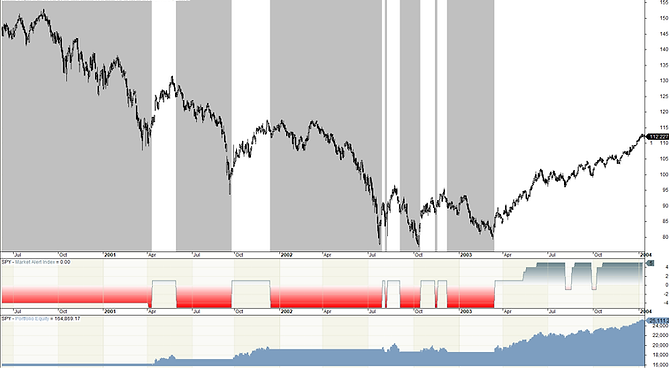
Bear market of the dotcom bubble 2000 to 2003

2008 financial crisis bear market

Corona crisis 2020
How has the Market Alert Index performed in the past?
So far, the Market Alert Index has excellently recognized every crisis in the past.
The Market Alert Index is not infallible either:
It happens that the Alert Index hits, although there is no strong bear market afterwards. But to be better prepared than to get caught up in the wheels. Nobody will be able to say how difficult the next stock market crisis will be.
Receive weekly performance report